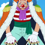
Plickers - 9
Key:
Green - Improvements
Red - Peer Assessment
Pink - Teacher Assessment
Unit 32: Concept Art for Computer Games
Purpose of Concept Art -
Concept art has been around in video games ever since the establishment of the industry. It’s a form of illustration revolving around pre-production designs, ranging from products like cars, toasters, movies and of course video games. Its main purpose in video games is for a designer to show visualisations of ideas, for example, weapons, characters, landscapes and vehicles. Everything is designed before it goes into a game and these designs will all go towards the look and the feel of the final game itself. The need for concept art today is astonishing; designs can range from something as big as a Mausoleum or flooring tile textures or even something simple as big ugly monster teeth.
Styles of Concept Art
Line Drawing/Painting

Line drawing are drawings done using only narrow lines, without blocks of shading. When people refer to line drawing they can refer to multiple different types of line art, this includes:
- Blind Contour Drawing - A blind contour drawing contains lines that are drawn without ever looking at the piece of paper. This forces you to study a scene closely, observing every shape and edge with your eyes, as your hand mimics these on paper. The aim is not to produce a realistic artwork, but rather to strengthen the connection between eyes, hand and brain: a reminder that, when drawing, you must first learn to see.
- Continuous Line Drawing - A continuous line drawing is produced without ever lifting the drawing instrument from the page. This means that, in addition to outlines and internal shapes, the pencil must move back and forth across the surface of the paper, with lines doubling back on each other, so that the drawing is one free-flowing, unbroken line. To avoid the temptation to erase lines, it can be helpful to complete a continuous line drawing with an ink pen, varying the line weight, as needed, to indicate perspective and areas of light and shadow. Like the drawing methods described above, this drawing method develops confidence and drawing speed, and encourages your eyes and hand and brain to work together. Continuous line drawings work best with in-depth observation of your subject, without interference from your thinking mind.
- Contour Drawing - A contour drawing shows the outlines, shapes and edges of a scene, but omits fine detail, surface texture, colour and tone (‘contour’ is French for ‘outline’).
- Planar Analysis Drawing - A planar analysis drawing simplifies complex curved surfaces into flat planes, using straight lines. This process helps artists and viewers to think about the underlying structure of objects and results in an analytical drawing, that is rather mechanical in appearance.
Photorealistic Drawing/Painting

Photo-realism, also called Super-realism, American art movement that began in the 1960s, taking photography as its inspiration. Photo-realistic painters created highly illusionistic images that referred not to nature but to the reproduced image.
Photo-realism grew out of the Pop and Minimalism movements that preceded it. Like Pop artists, the Photo-realists were interested in breaking down hierarchies of appropriate subject matter by including everyday scenes of commercial life—cars, shops, and signage, for example.
Charcoal Drawings

Charcoal is one of the oldest art mediums, having been used for cave drawings by early man. Back then, charcoal was used in the form of the ends of burned sticks. Today’s charcoal artists have more modern options: compressed charcoal, vine charcoal, and powdered charcoal. The charcoal you use in art most commonly is compressed charcoal, which is powdered charcoal that has been mixed with gum binder and then compressed into sticks. The amount of binder used determines how hard or soft the stick will be.
Tonal Drawings/Paintings
Tone of any object is assessed from how light or dark it is be it a bird or a mountain. Now, to differentiate between two objects that are drawn if one is light and the other darker, your eyes will easily perceive the difference. This variation of light and dark is signified by variation in tone. Tonal drawing is the variation of black to grey that is given to a drawing on paper usually with a pencil. Tonal Drawing is a recent development that has somewhat emerged from linear drawing and a sketch with tonal drawing will emphatically portray more of light and dark shading rather than thin edges and lines of the image. So, simply put Tonal drawing is the art of gradual increase or decrease from light to dark from one part of the drawing to another
Oil Drawings/Paintings

Oil painting, painting in oil colours, a medium consisting of pigments suspended in drying oils. The outstanding facility with which fusion of tones or colour is achieved makes it unique among fluid painting mediums; at the same time, satisfactory linear treatment and crisp effects are easily obtained. Opaque, transparent, and translucent painting all lie within its range, and it is unsurpassed for textural variation.
Wash Paintings

Wash drawing, artwork in which a fine layer of colour—usually diluted ink, bistre, or watercolour—is spread with a brush over a broad surface evenly enough so that no brush marks are visible in the finished product. Usually the technique is used in conjunction with lines made by a pen or pencil that define and outline, while the wash provides colour, depth, and volume. The free use of coats of wash first appeared in the works of such 15th-century Italian artists as Sandro Botticelli and Leonardo da Vinci. Within the next 100 years, this technique was so highly developed that two-tone washes were used concurrently, one shading into the other.
Shading

Colour Psychology -
Red - This color is a warm and positive color associated with our most physical needs and our will to survive. It exudes a strong and powerful masculine energy. Red is energizing. It excites the emotions and motivates us to take action. It signifies a pioneering spirit and leadership qualities, promoting ambition and determination. Being surrounded by too much of the color red can cause us to become irritated, agitated and ultimately angry.
Blue - This color is one of trust, honesty and loyalty. It is sincere, reserved and quiet, and doesn't like to make a fuss or draw attention. It hates confrontation, and likes to do things in its own way. Blue is reliable and responsible.
Green - This is the color of balance and harmony. It is the great balancer of the heart and the emotions, creating equilibrium between the head and the heart. From a meaning of colors perspective, green is also the color of growth, the color of spring, of renewal and rebirth. It renews and restores depleted energy. It is the sanctuary away from the stresses of modern living, restoring us back to a sense of well being. This is why there is so much of this relaxing color on the earth, and why we need to keep it that way. On the negative, the color green can be possessive and materialistic, with a need to own people and things.
Orange - The color orange radiates warmth and happiness, combining the physical energy and stimulation of red with the cheerfulness of yellow. Orange relates to 'gut reaction' or our gut instincts, as opposed to the physical reaction of red or the mental reaction of yellow. Orange offers emotional strength in difficult times. It helps us to bounce back from disappointments and despair, assisting in recovery from grief.
Yellow - This color relates to acquired knowledge. It is the color which resonates with the left or logic side of the brain stimulating our mental faculties and creating mental agility and perception. Being the lightest hue of the spectrum, the color yellow is uplifting and illuminating, offering hope, happiness, cheerfulness and fun. In the meaning of colors, yellow inspires original thought and inquisitiveness.
Black - The color black relates to the hidden, the secretive and the unknown, and as a result it creates an air of mystery. It keeps things bottled up inside, hidden from the world. This color gives protection from external emotional stress. It creates a barrier between itself and the outside world, providing comfort while protecting its emotions and feelings, and hiding its vulnerabilities, insecurities and lack of self confidence. Too much black can cause depression and mood swings and create a negative environment. Combined with white only, it can create an argumentative atmosphere.
White - White is color at its most complete and pure, the color of perfection. The color meaning of white is purity, innocence, wholeness and completion. White is the color of new beginnings, wiping the slate clean, so to speak. It is the blank canvas waiting to be written upon. While white isn't stimulating to the senses, it opens the way for the creation of anything the mind can conceive.
Sonic The Hedgehog Concept Art


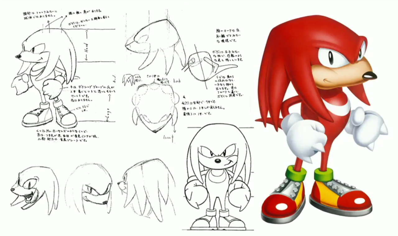


Sonic the Hedgehog, A.K.A Mr Needlemouse (SEGA Genesis)-
Mr. Needlemouse was a name given to several prototypes of the character Sonic the Hedgehog on an early concept art sheet by his designer Naoto Ohshima. The name is an alternative translation of "Mr. Hedgehog", as needlemouse is a literal translation of the Japanese word for hedgehog. The graphical style of Sonic the Hedgehog was extremely impressive for its time, especially for the Mega Drive hardware (the Super Nintendo being technically superior in terms of graphic capabilities). With a color pallette expanded beyond what 8-bit systems could do, each zone was given a unique and rich look. The graphical style was inspired by the then-new world of "computer generated" graphics, the visuals of the Green Hill Zone being the most prime example. Even the sprites of Sonic, Eggman, the enemies, and the rings reflected on this, each richly animated object jumping out of the screen. While other games of the era can look dated, Sonic the Hedgehog has been able to maintain a timeless feel, emphasized by the visual work of Naoto Ohshima and the fact that the original game still sells, albeit on modern hardware. Over the 25+ years in which Sonic has served as entertainment for millions of people around the globe, his art style has changed. This is primarily because of technology advancing allowing a much more advanced design from textures to shadows. This can be seen throughout because of the change from 16-bit pixel art to a polygonic approach to a more 3D realistic look.
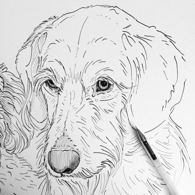
Sonic the Hedgehog on the SEGA Genesis saw a more robust and blocky Sonic because of the limited power of the game console itself. The concept art for sonic started with line art, which is the basic line that defines the character, building or anything else the artist is intending to draw.
Rocket League Concept Art

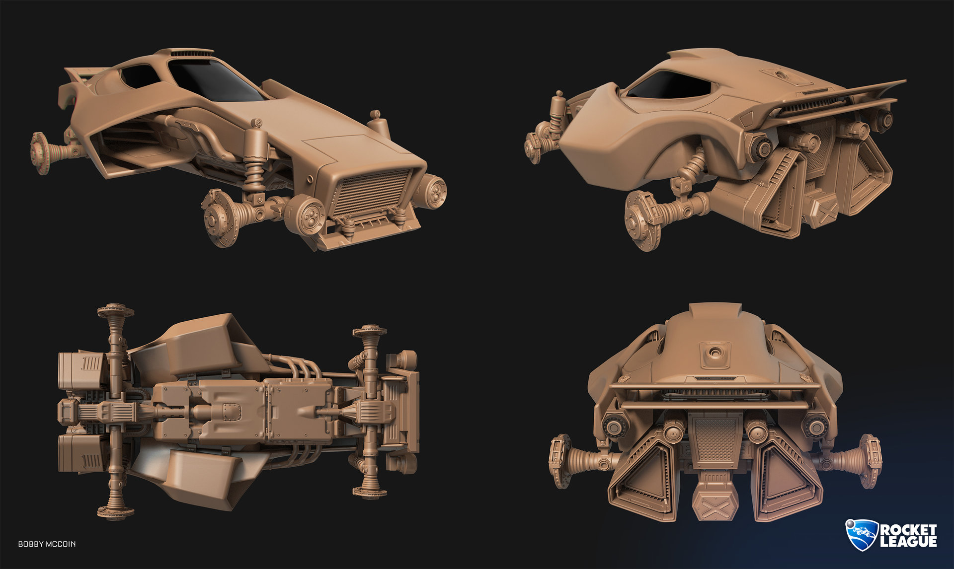


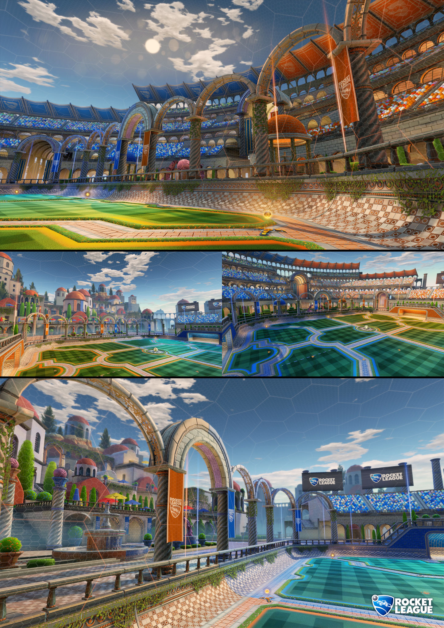


Rocket League (Xbox, Playstation and PC) -
Rocket League has taken the sports genre of the video game industry by storm with its unique physics and its cross platform ability of multiplayer. Rocket Leagues predecessor was the great Super Acrobatic Rocket-Powered Cars (SARPBC) which first released in 2004. Rocket League began its development in 2008 and was in development in for 7 years due to the Psyonix(Company who made the game) facing money issues and lacking the time to work on it. As you can see on the image above, you can see that the car above has gone through multiple design stages in order to look as beautiful as it is in game. The initial concept behind Rocket League was a grand series of mini-games to test every aspect of automotive acrobatics in an open world. Cone still hopes to follow up that first pitch, but after their experience with SARPBC, Psyonix knew their best bet was to pick a single goal and nail it. That goal became scoring goals – using your leaping vehicles to steer a giant ball towards an opponent’s goal.
Target Audience - Rocket League's target audience is anyone over the age 3 because it features simplistic controls and no violent images except from when you collide with an enemy at high speed which causes them to blow up however, when they are blown up is shows comic style text which says "boom!" which makes the images less disturbing and more humorous. This game has no hidden messages that it is trying to influence a gamers decision on certain issues with the first world, which is good because gamers want to be relaxed and having fun while playing this game. The art style for Rocket League is cartoony yet realistic because it provides the cars and landscapes which dynamic features such as rain hitting the car and bouncing off or leaving a trail in the snow where you have drove through. It has been designed this way to make the player feel excitement when playing so that they feel the urge to continue playing. The game incorporates the use of primary and secondary colours which suggests the game is suitable for a young audience, also the game only allows the use of darker colours as a secondary colour on your car which stops the clash of colours on each team and it stops any confusement between the two teams of players.
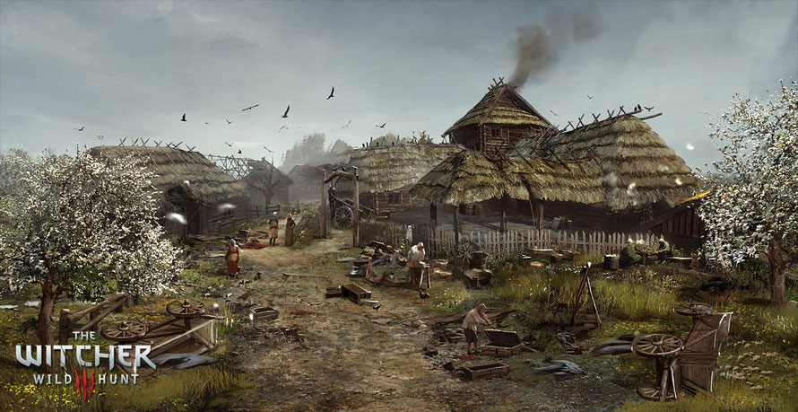
The Witcher 3: Wild Hunt (Xbox, Playstation, PC) -
'The Witcher 3: Wild Hunt, 19 May 2015, CD Projekt RED' concludes the story of the witcher Geralt of Rivia, whose story to date has been covered in the previous titles. Continuing from 'The Witcher 2, 17 May 2011, CD Projekt', Geralt seeks to move on with his own life, embarking on a new and personal mission while the world order itself is coming to a change. The world of The Witcher 3 has a wild, medieval-like tapestry of colour everywhere, from flora to fauna to fortress. The Witcher 3 gives the gamer an idea of real world imagery whereas a game such as 'Skyrim, 11 November 2011, Bethesda Game Studios' is purely imaginative fantasy. This game struggles with its combat system because they have tried to repeat the same style through all 3 of their games but it is still very buggy and repetitive. Compared to the other games I have listed this is the most beautiful and satisfying to those who are willing to put the time into the game. Target Audience - Witcher 3's target audience is aimed at mature, adult gamers, and doesn't try to pander to the teenage mindset.
This is concept art for the game Witcher 3, the style of the concept art is designed to represent the fantasy, medieval and near wilderness. Fantasy is shown by the blossoming trees and the luscious green grass which emphasises a sense of life in the foreground which is a contrast to the images in the background where you can see burned buildings, bare boned trees and birds circling suggesting a sense of torment and destruction. Also in the foreground you can see a cart destroyed and scattered across the village which suggests that something left a path of destruction and is going to cause more destruction behind the image.
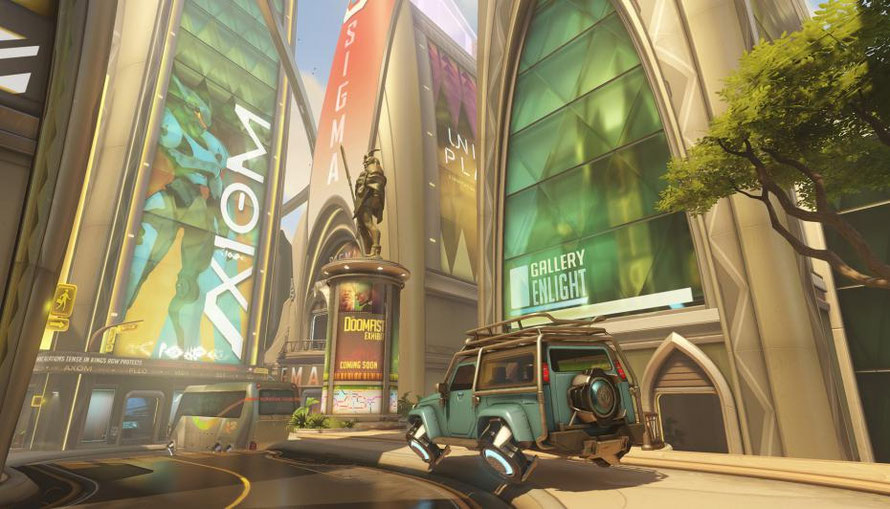

Overwatch (Xbox, Playstation, PC) -
Released May 2016, this game has been massively popular with the gaming community because of its curators, Blizzard, who are also responsible for creating these masterpieces: Warcraft, Diablo and Starcraft. Overwatch is a first person shooter with the aim of capturing objectives and defending them or escorting them to the their destination. As you can see from the image on the right, this character, D.Va, had multiple versions of her suit and her character until they finally found the right balance of what the character needed. This can be seen in many of the other characters such as Pharah, who is a jetpacking assault hero who utilises rockets in order to deliver high ordnance and high damage however she is still susceptible to splash damage from her own rockets. This game is different compared to others because it features a wide variety of heroes, some which block damage, some that heal and other who utilise unique weapons such as dual shotguns or shurikens or a bow and arrows.
This is concept art for a map in Overwatch, the style of the concept art is designed to represent a futuristic, first person shooter. The futuristic features can be seen throughout the image such as the vehicles they do not have wheels, instead they levitate above the ground, also there are holograms dotted around the image which suggests that technology has advanced so far that images and text can be projected onto buildings to promote items, also you can see that there is an image of a robot projected which suggests some form of AI. This concept art uses lots of bright colours which suggests this city is lively and is prosperous. However, in the background, with the building with a robot on, you can see bright red text flashing across a banner, which suggests danger.
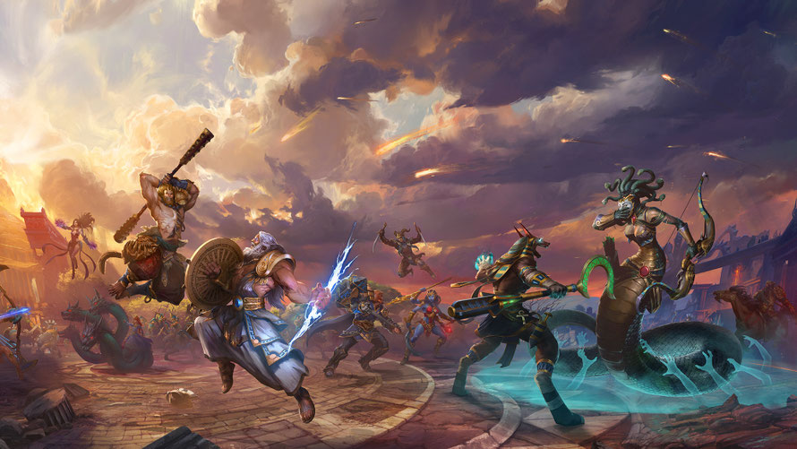
SMITE (Xbox, Playstation, PC) -
SMITE was released on the 24th of March 2014 by Hi-Rez Studios and it falls under the Multiplayer Online Battle Arena aka MOBA genre. The game incorporates the gods of old from multiple different pantheons such as the Greek and Norse pantheons that feature Zeus, Odin, Thor, Aphrodite. SMITE features multiple game modes such as Arena and Conquest. In Arena, the aim of the game is to eliminate gods on the opposing team and their minions to deduce their points while they do the same. You have 500 tickets in total and every time a minion dies it deducts a single ticket, when a god dies it deducts 5 tickets and if the siege minion makes it to one of the portals it deducts 10 tickets. In Conquest, your objective is to advance up the lanes and siege towers, erase phoenixes and obliterate their titan. There are multiple camps placed in the jungle which gives the gods a boost to one of their aspects such as Power or Movement Speed.
This image is concept art for 'SMITE, 2014, Hi-Rez' and is designed to show the fantasy and good against evil genre. I know that this is present because in the background you can see ominous looking clouds and wonderful rays of sunlight. This could represent the forces of good and evil waging war against each other because you can see many of the characters engaging in combat with their opponents.Also the colour scheme for the good is bright luminescent colors with golden yellows and bright blues whereas the opposing colours are darker to represent that they are waging war against the good side. The fantasy aspect is represented by what the characters are doing, for example one of the most visible battles is between Anubis and Medusa, Anubis' colour palette uses luminous blues and golden stripes whereas Medusa's colour palette is more of a grungy green and dirty yellow. These are both characters whose colour scheme and stance represent the team they are fighting for. Furthermore, in the background you can see that there are not only these omnipotent characters, there also humans who worship these deities and are fighting for their cause which represents the idea of religions or cultists following these deities into battle. Also the humans could be seen as insignificant because they do not have a large presence in the image, they are forced into the background and serve as cannon fodder in the game. Fireballs can be seen in the sky rocketing towards the olympian like structure on the left which represents that there could be a being more powerful and destructive than the characters that we can see in the image itself.
Case Study on Concept Artists


All of the artwork above was created by Sung Choi, a senior concept artist working at Bungie, the company responsible for the creation of the Halo series and Both Destiny games. His artwork is inspired by post apocalyptic worlds or alien worlds where you can clearly depict the general mood and theme. The first image shows an invasion occuring on a snowy planet, possibly Earth. The most prominent colour you can see is red and its multiple shades, this shows that the creatures in the image are not neutral or friendly in any regard, they are there on a mission and could be the eradication of a civilisation. The second image, is of an alien planet with huge transport like structures preparing to leave the planet. This also shows a hostile environment. The final image is more homely, to the fact that you are shown a sunny, green paradise, however you can see this area has been lost to time because of the overgrowing plants and the rusted structures in the background hidden behind the trees.


The artwork above was created by Yohann Schepacz, a freelance concept artist who has worked on games such as, Horizon Zero Dawn, Rise of the Tomb Raider and many others. As you can see, Yohann is an extremely talented artist, he uses colours to convey moods perfectly and detail on these images are out of this world. The first image shows a Musketeer defending himself against multiple enemies/bandits who have killed or injured others, you can see this from the blade/saber in the foreground of the image. The second image is concept art from the game Bloodborne, and the use of colour is effective because you can see light being blocked out by a creature in the foreground while the main character is stood holding a huge spear and a wooden shield. The final image is of a card from Magic: The Gathering called a Silumgar Assassin. The image shows that the character is strong because they are shattering the ground around them while thrusting a lance like weapon, also the most prominent colours in the image are light blue and dark blue. Light blue is commonly used to represent health and healing while dark blue is used to represent knowledge, power, integrity and seriousness.
Game Artstyles
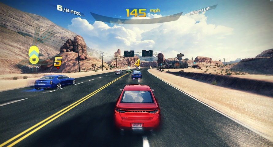
Games come out on many different platforms every year, such as the Xbox, Google Play Store, Apple, Playstation and PC. There are many reasons why these games succeed and other why they fail. For example, a game on a mobile device is limited to graphics setting and frames whereas if the game were to be run on a pc the pixel count would be higher and the graphics would look a whole lot better with a game. For example, 'Asphalt 8: Airborne, 22 January 2013, Gameloft':

Available on Apple, Android, Windows,and Amazon. In this game, the user chooses a car and races around the globe in order to gain reputation and money. On mobile devices, this game suffers to low frame rate and lower graphics however it is much easier to play on mobile because only few buttons are required. Whereas, on the PC version this game can have the most beautiful graphics and run at higher settings that which it runs on mobile devices. As you can see from the image above, it shows a player racing, from his screen you can see that he only has a few controls. One for accelerating, one for braking and the blue buttons are for boosting. He turns my tilting the device to the direction he wants to turn. Whereas, on the PC, the player would use either WASD or the arrow keys to drive and the spacebar to initiate the boost.
Uses of Different types of Art
Throughout the game industry, we can see different types of visual designs for games, such as the comic book/cartoony style of borderlands or the surreal mythological plains of The Witcher 3 or even the close to reality looking 'GTA V, 17 September 2013, Rockstar Studios'.
Grand Theft Auto V follows on the series of Grand theft auto games where the player roams the streets of a city and completes task. GTA is popular because of its surreal realistic gameplay, players can get lost by the amount of fun they can have by doing simple things such as performing jumps, driving up tall mountains and invading military bases. GTA IV and GTA V are considered by Rockstar as the HD universe due to the graphical capability achievable on their systems. The game engine which runs GTA V is the RAGE (Rockstar Advanced Game Engine) and has integrated a few third party middleware components into RAGE like the proprietary Euphoria character animation engine and the open-source Bullet physics engine. With this game engine they put the actors who were going to play the characters and used motion capture technology to create the characters in the game. However the audio was not recorded with motion capture instead this was done in a studio.
'Borderlands, 2009-2014, Gearbox Studios' is a series of games which is portrayed in the comic book cartoon style because it's a game which is very humorous for a first person shooter which adds a large amount of gore to the cartoon style. Borderlands features many pop culture references throughout the series of games such as the minecraft easter egg, the mutants living in the sewer who like to eat pizza and who can forget Mr Bubbless and Lil' Sis.


As you can see from the images above, Gearbox Studios has used a technique called Cel shading. This technique is used to create a non-photorealistic 3-D computer graphic which appears to be flat by using less shading color instead of a shade gradient or tints and shades. Cel-shading is often used to mimic the style of a comic book or cartoon and/or give it a characteristic paper-like texture. There are similar techniques that can make an image look like a sketch, an oil painting or an ink painting.
Clowning Around
It is 1962 North America, the gamer controls the main character Alex ‘Giggles’ Malone, Alex has been having a tough time, juggling his home life and his work. He works in a travelling fun fair as the resident clown. Performing tricks and jokes for the few people who still attend the fair.
The game begins on a ‘normal’ day for ‘Giggles’ waking up after a heavy night on the laughing gas, as he leaves his rugged trailer he finds himself on the outskirts of a post-apocalyptic fun fair. Although this is the way most visitors would describe the fun fair on a normal day, this is not a normal day. The fair has had a large meteor land flat bang in the centre of it, on top of the central circus tent.
All of ‘Giggles’ friends and colleagues are now mutated almost beyond recognition and hungry for more than candy floss and toffee apples (although most were already part of the freak show anyway) Giggles must fight his way across the landscape, past various rides and amusements to get to the central tent where his beloved clown car (Betsy) is, so he can make his escape.
We have an idea how we would like ‘Giggles’ to look but we do not have the ability to create him ourselves, so we are putting this task to you. We have some criteria that must be abided by:
• Look like a clown
• Be appropriate for the era of 1960’s
• Be appropriate for the location of North America
• Look tattered and rugged – rough, dirty, unshaven – 2/3 mins to add these.
• Clown Make up – although worn, smudged
• Big shoes
We also will have various weapons that can be located throughout the playable area, although we currently are undecided on what these could be, we would appreciate it if you could sketch and design us some ideas:
• Must be items found on a circus/fair
• One ranged
• One two handed
• One, one handed
From what I can see from the Clowning Around brief, I can see that it has the opportunity to be completely separate from all other games on the market because there aren't many clown based games. If the game is made correctly it could lead to huge success. The brief features what the requirements for what Giggles should look like and what weapons should be available from their theme. However, the brief does not state what the required art style is so it gives many options such as pixel art, hyper-realism, stylised, tonal, etc. The brief also specifies that items/weapons should be items which are found in circus'/fairs which gives us the ability to turn the once harmless fun objects found into lethal weapons such as in 'Dead Rising 4, Capcom Vancouver, 6 December 2016' where you can find harmless items in a shopping centre and turn them into lethal weapons of destruction like the segway-golf cart combo which you can drive around shooting golf clubs at zombies and hit them with gold clubs at the same time. The game brief also doesn't mention what the game's genre is going to be which further adds to creativeness of the concept art. The game could be a cartoony action-adventure such as 'Borderlands' which uses current pop culture and jokes to make the game more entertaining. On the other hand, the game could also be a horror game such as 'Outlast, Red Barrel Studio, 4 September 2013' where you are walking around an remote psychiatric hospital with no idea whats around the next corner.
Clown Concept Ideas

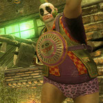


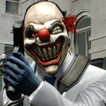

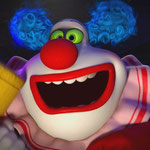
Clown 1 - From first appearance, the clown seems innocent but you can see that he is looking at the camera very psychotically and you can see in his hands he is holding a weapon which shows he has intimidating presence and seeks to cause harm.
Clown 2 - At first glance the clown looks quite normal, however if you look close you can see that he is wearing a Pirates hat and overcoat which suggests he has a strong presence. As you can see in his hands, he is holding daggers in between each of his fingers which suggest that this clown could be out for blood.
Clown 3 - Though his appearance is not very... clown like it still represents a clown because he has the face paint and the hair styled but his appearance also shows that he could be part of a cult because of the emblem on the hub cap on his chest. This clown's appearance shows defiance of what a normal clown should look like.
Clown 4 - His appearance suggests that he was a jester of some kind, however on further inspection you can see that this clown is carrying a dagger which is dripping with blood which points towards this clown being a psychopathic killer who enjoys theatrics.
Clown 5 - Although he may look very tattered and old this clown is a psychopathic villain who schemes to destroy a city using his methods. This has a strong influence on my game because it looks like this clown has a post-apocalyptic look of him with the scars and smudged makeup. Also this clown has a hyper-realistic approach because you can see all the wrinkles, spots and follicles on his face.
Clown 6 - This looks very simplistic and normal and he looks kind compared to all of the other clowns, his appearance made him look cute and lovable. However, the big green boxing gloves may suggest that this cute and lovable look is a facade to his true nature.
Clown 7 - This clown is mainly a mask to hide one's true identity while committing a felony. It is also used to strike fear in the hearts of the victims and keep them incapacitate while the clown robbed the place.
Clown 8 - From first glance, you may think that this clown is harmless but this innocent facade can be unveiled by looking closely at the face. It has a curved lines for its eyes and a huge grin on its face which suggests this is a veil for his true nature.
Clown 9 - This style of clown was used for a kids movie, and it is meant to look innocent however the child's dream has made the clown seem more threatening than it should look.
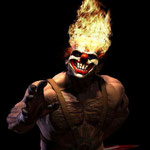
Clown 10 - This clown looks most threatening of all due to his psychopathic smile and flames bursting from his head. This suggests that this clown is hellbent on destruction and is willing to do whatever it takes to do this.
Popplet
Sketches

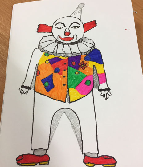
These are the images I have created for Clowning Around. To create these images, I used pencils and a few coloured pens to create Giggles and some of the items which will be found around the circus/fair. I created Giggles to be similar to that of a 60's clown with a big red nose, red hair and the party hat. I added stubble to give the idea that Giggles hasn't shaven in a fair bit of time. I have added patches on Giggles' shoes to represent the idea that these shoes are tattered and in disrepair.
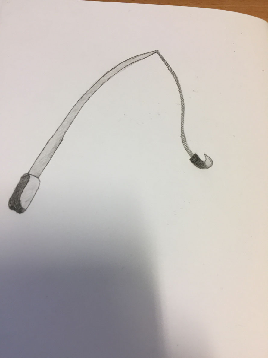
Also, I have created these items for Giggles to find throughout the Circus/fair because they are common items at Circus/Fair. I started off with an item which is a common attraction at a circus/fair, a firebreather stick and the special item, Corn Starch which will be used as a special attack that breathes fire, cremating enemies in his path. The second item I drew was a Clown's Pie which would have the ability to incapacitate it's victim for a short amount of time, I also thought that this item, when it splat would have a cone radius on impact which would affect the enemies behind the main aggressor. The third item was a toffee apple which at first I was trying to make it a two-handed weapon but I thought that this item could be used to keep enemies at arms length and to climb over obstacles due to their sticky properties. My final item I drew was my two-handed item which I chose to be a Fishing Rod which would normally be used to hook ducks but in this case it will be able to the hook enemies and use them for a spin attack.
Specify/link back to experimentation, E.g. why you used pencil
Requirements:
• Look like a clown
• Be appropriate for the era of 1960’s
• Be appropriate for the location of North America
• Look tattered and rugged – rough, dirty, unshaven
• Clown Make up – although worn, smudged
• Big shoes
As you can see my clown has been drawn to fit in with the 60's era, I have incorporated many techniques such as cross hatching, toning and shading. I have met most required targets, however I have not made the clown look tattered and rugged. I could improve this by adding stubble, his coat being torn, toe poking out of his shoe, patches on his coat, etc.
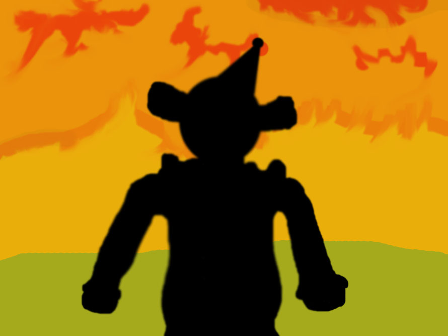
The character is coated in shadows which presents a mysterious aura to the audience, we cannot see the detail on the character further strengthening the aura of mystery about him. As the viewer, we cannot distinguish any details about the character, and we do not know his past life or his future, all we see is a mysterious character. Also, his fists are clenched which shows that the character is angry and has lost control of his feelings. The character is dominating the picture with his presence, this may present a strong presence and may suggest that the character may be a main character. The picture is covered in reds and oranges, this is possibly referring to the rage boiling inside of him and he needs to find a way of releasing it. This anger may suggest his heart is in a losing battle against his brain, the brain is ordering him to feel anger and pain. This may link to the characters history.
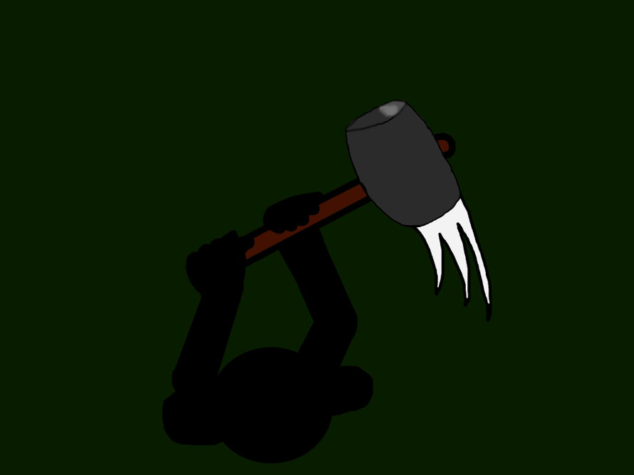
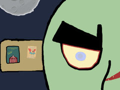
From the image, we can see that a shadowy presence is created by the character swinging his weapon violently. A mysterious aura is created and leaves the audience with suspicions about the character. The most prominent colour in the image is Green, green is commonly associated with envy, envy is a feeling of grudging admiration for another's talent, integrity, personality, looks, money or happiness. Envy oftens serves as the motivation for different acts. Envy may lead one to avoid, to dislike or to insinuate the so called superior person is bad to make others think badly of them. This envy could link to the anger boiling/raging inside the character which also the links to the use of weaponry as a form of release. The weapon is commonly used for close combat, and this suggests that the character has a personal grudge against someone linking back to the idea of envy. The white in the image comes from the movement of the hammer, this connotes the idea of the weapon swung to release the anger as white is commonly used to represent pure and good intentions.
Character Backstory
Alex Malone was born into a troubled family in 1934. His parents were unable to keep a steady-paying job in the big cities. They decided to send Alex to a better home so that he could have a better education and wont have to constantly move around trying to find jobs. Alex was sent to his Grandparents who lived in the countryside. Alex enjoyed his time with his grandparents, they treated him as if he was their own son. On a hot sunny day, a circus arrived in the countryside and Alex's grandparents took him to see it. He enjoyed the circus, however he believed his parents would not allow him perform at the circus, so he decided to run away from home and pursue a life in the circus as a clown. He is stuck in this job, and all the laughing gas he has taken has affected his memory. He doesn't remember where he came from, where he was born or if he has any parents...
Thumbnails

Create character, enemy and enviroment and go into depth/use colour meanings.
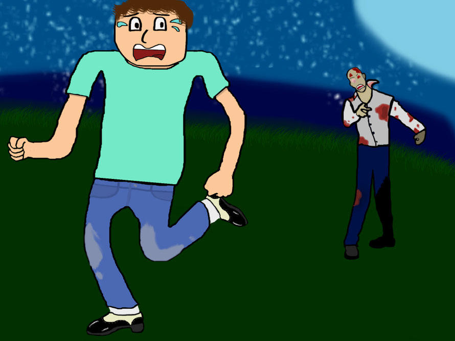
For my thumbnails, I have created 3 images that are giving an overview of what the game might be like. The first image/thumbnail is of Alex 'Giggles' Malone facing up against a mutant/zombie which has lost a food, this could be due to the meteor impact or that Alex Malone has hit it off. The second image/thumbnail is of the circus before the meteor hit, but as you can see the meteor is about to impact with the big top. The third image/thumbnail is of a zombie/mutant which is prowling around at night. You can see that this character is slowly decaying or already dead because on its wound on its nose, there are maggots crawling around on the tissue. The moon is very prominent in the image, this is to show that this is the only light source available and the main character will become heavily reliable on this light.